How to Create High Converting Landing Pages Part 3 - The Isolation Tank


Welcome back to our five-part series on creating and optimizing landing pages for increased conversions.
If you haven't read Part One or Part Two yet, click the links to do so. And don't forget, technology and consumer tastes are always changing, so keep testing and tracking performance to stay ahead of the curve.
Today we're looking at the power of removing distractions from your landing page.
The Isolation Tank Defined & Design Tricks
One of the most important things you can do when sending traffic to a page is making sure users stay on task. You want them to complete the action on the page without bouncing or clicking through to another part of your website.
To ensure this happens, you need to put them in the "Isolation Tank" on your landing page. The Isolation Tank concept removes distractions, such as:
- Header and footer links that take consumers away from your sales funnel. Use anchor links that pull users down the page, instead of outbound links that take users to other pages.
- Links within the copy that push users to other sources and pages. For resources, insert a numbered list of supporting sources at the bottom of your landing page (below the call to action and sales button).
- Videos and images that are used as "fillers" that are more of a distraction than pushing a user to convert.
Here's a great example of what we're talking about:
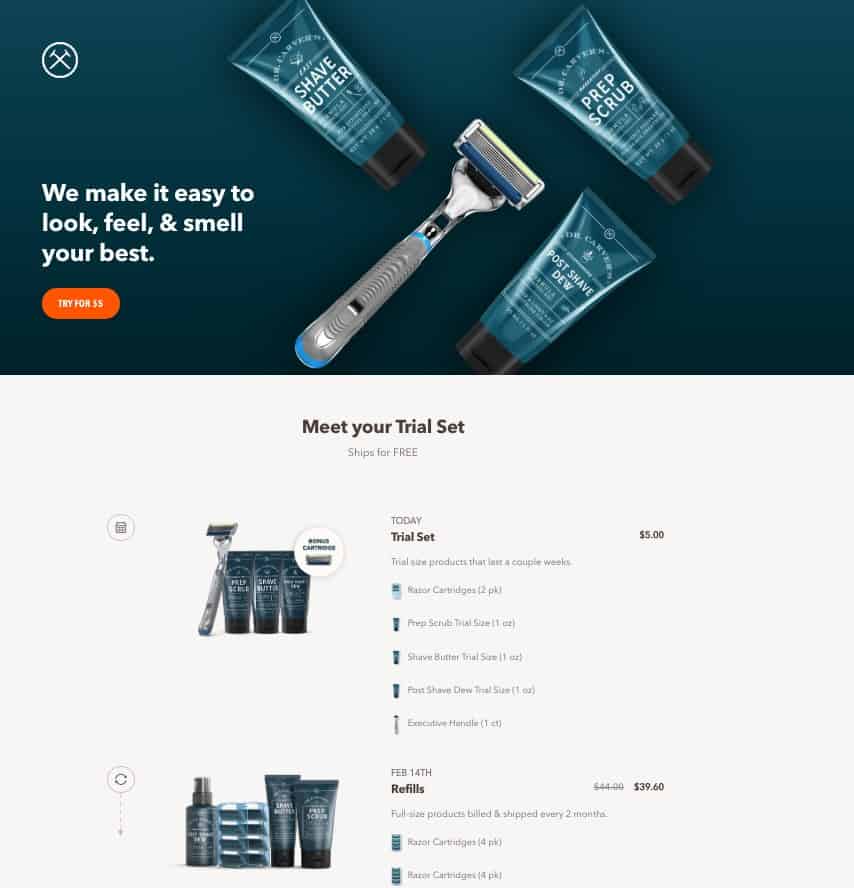
Dollar Shave Club has always done this amazingly well. On this particular landing page, they don't include any header links at all. Their strategy is to drive the user right down the page to make a conversion.
They also keep things simple, information-rich, and to the point. The founders of Dollar Shave Club were so successful with their pinpointed digital marketing approach that they sold to Unilever for $1 Billion in cash.
Optimize Your Lead Capture Form
If you're capturing leads, optimizing your lead generation forms may be the quickest and easiest step you can take.
Numerous studies have been conducted surrounding landing forms, and wildly enough, the more information you ask for the lower your conversion rates will be.
The key is to provide just the right amount of information to be offered and a minimal number of required fields as a part of the flow.
Instead of having multiple fields for someone's name (i.e. first and last), just have a single named field. And consider not asking for a company name, as you can ask that later.
Wordstream ran a test for Cash4UsedCars.com and noticed the following:
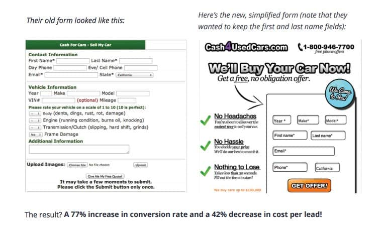
They saw a whopping 77% increase in conversion rate and a 42% decrease in cost per lead. Just by revising their form.
It must also be mentioned that the new form is more modern and sleek in design. Plus, the checkmark oriented benefits on the left reinforce the idea that getting started is easy and hassle-free.
The following is another example from Wordstream. Modernizing and making this lead form stand out more made a huge difference:
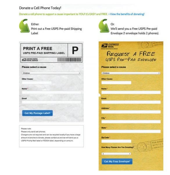
The above design change led to a 53% increase in donations. The beauty of this effort is that it didn't take any additional advertising budget to accomplish this feat.
It's safe to say that forward-thinking design can go a long way! And sometimes the adjustments needed aren't that significant.
As you move through changes to your landing pages, make sure you keep a testing plan in mind. It's vital that you make data-driven decisions that lead to the greatest levels of success possible.
Every action you take on your landing pages should have sound reasoning behind it.
More landing page tips to come in part four of our landing page optimization series. Stay tuned!
If you want more advanced, in-depth tips and methods from myself and other experts, join our premium group at Join.AdLeaks.com.


