Your Guide to Email Design Best Practices for 2021


ECommerce marketing is all about leveraging various channels to ensure a steady influx of new and existing customers. And of all the digital marketing channels, email marketing still has the highest ROI at 4400%.
With eCommerce businesses all gunning for steady growth, the email marketing competition has toughened. After all, your email is only as good as it converts, and using email design best practices can spell the difference between a successful sale or an unsubscribe.
How Important are Email Design Best Practices for Email Marketing?
Many would argue that subject lines are more important than the look of an email. After all, a beautiful email has no chance to convert if it’s not opened at all.
But if your segmentation strategies are effective and your subject lines have high open rates, the email itself will take center stage. And email design is more than what an email looks like. Email design best practices address all of an email’s different elements to generate sales.
Because a poorly designed email can result in a potential customer either deleting your email or unsubscribing. And that wasted opportunity represents money left on the table if you’re an eCommerce store.
So how exactly does email design benefit email marketing strategies? The data may surprise you:
- 80% of users delete an email right away if it doesn’t look good on their mobile device.
- Adding something as simple as GIFs to emails has shown as much as a 103% increase in conversions
- Including videos in emails can increase click-through rates up to 500%
In short, well-designed emails translate to better customer experiences and higher conversion rates over time.
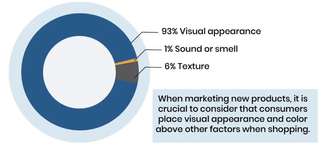
While there are a lot of factors contributing to the success of an email marketing strategy, email design is one factor that eCommerce business owners should not take for granted. Email design plays a huge role when it comes to conversion.
7 Email Design Best Practices to Help Your Brand Stand Out
Email design is more than just making sure your emails look good. Email design best practices optimize your messages for conversions and results.
Also, you don’t have to reinvent anything or start from scratch. Just apply the right email design best practices to your existing campaigns and you can use the results as a baseline as you run tests and improve your email flows.
Here are the seven top email design best practices that you should leverage this 2021.
1. Review the Anatomy of a High-Converting Email
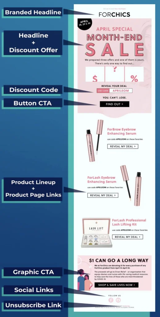
Again, you don’t have to create brand new email templates just to implement email design best practices. Here’s a good framework for an effective email layout.
Place five essential elements above the fold so the recipient won’t have to scroll down to see them:
- Branded headline
- Offer headline
- Discount information
- Discount code
- Button CTA
Positioning these items above the fold entices your subscribers and encourages them to continue checking out the rest of the email.
In the remaining sections of your email, you can showcase your product lineup and link to their product pages.
Don’t forget to add an attention-grabbing CTA button or graphic at the end so the consumer won’t have to scroll up again. Remember, streamlining the purchase process for subscribers is even more important than creating an attractive email.
2. Responsive Design is Not Optional
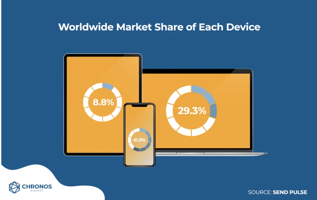
The amount of time that mobile users spend online is 200% longer compared to laptop or desktop users.
If you want to maximize your reach and conversions, you have to make an impact on your customers where they are, which means reaching them on the devices they use.
Of course, this presents design challenges for your emails. Just because an email looks good on a desktop computer doesn’t mean it will look as good on mobile devices.
Fortunately, modern email marketing platforms like Klaviyo automatically optimize emails for mobile viewing and offer previews of how your email will look on different devices. If you haven’t yet, check this feature out and start leveraging it to get the most out of your emails!
3. Don’t Stray Far from Your Brand
Email marketing works best as a complement to all your other marketing channels. Therefore, an essential of email design best practices is that your emails should support your branding.
When potential customers see your emails, they should recognize your brand easily. This will help ensure a consistent experience and instill trust as they go from awareness to purchase.
Remember that leveraging your brand includes telling your story. An effective email marketing strategy builds your brand by telling that story and keeping your offer front and center.
4. Follow the Recommended Visual Hierarchy
Visual hierarchy is one of the most important email design best practices that marketers use.
In essence, the visual hierarchy makes your emails both attractive and effective. It also directs your subscribers to the most crucial elements, such as CTAs or discount codes.
Finally, a visual hierarchy makes your email easy to read and understandable because the content and design elements flow naturally according to the normal pattern of reading.
Two of the most popular hierarchies are the Z pattern and the inverted pyramid, which is similar to the anatomy diagram shared above.
5. Design with Dark Mode in Mind
When dark mode started growing in popularity across apps and devices, designers had to adjust.
Designing for dark mode adds an extra layer to the designing process. Basic fixes involve using transparent images or backgrounds and adding a white stroke around dark-colored fonts.
Litmus offers a guide for creating dark mode emails, and Klaviyo also has email design best practices for dark mode.
6. Know When to Use Graphic Emails and Plain Text Emails
When one talks about email design, the first thing that comes to mind is full-on graphic and HTML-based emails. But effective email marketing keeps your business alongside your consumers every step of the way, from acquisition to conversion to retention.
Different stages of the customer journey often require a shift in marketing approach, which can affect the emails you send. One case study in 2020, for example, found that text-based emails actually worked better for cart abandonment flows than HTML-based messages.
7. Never Stop A/B Testing
While putting email design best practices in place is essential, it’s important to remember that design is also subjective. Different consumers have different tastes and preferences when it comes to products and shopping habits.
In other words, what works best for some customers may not work best for others.
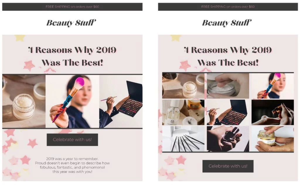
The anatomy of a highly-converting email will help you get results, but combining these practices with an understanding of what works best for your subscribers will get you even better results.
Unearthing that knowledge usually requires investing in A/B testing. Running tests is the most effective way to keep optimizing your emails and doubling down on the elements that work.
Here are a few A/B test ideas that you can start with:
- CTA buttons vs. text-based buttons
- GIFs or videos vs. static images above the fold
- Long vs. short hero images
- Product block layout
Email Design Best Practices Can Fuel eCommerce Growth
While email marketing involves a lot of technical stuff like deliverability and segmentation, effective email design directly contributes to higher click-through rates and more conversions.
You can combine all of these best practices into one integrated strategy in Chronos Agency’s Blueprint to Succeed with eCommerce Email Marketing for online retailers.
Further, you can apply for a strategy session with one of our experts to develop a tailor-made plan for your eCommerce growth.


