3 eCommerce Welcome Emails That Your Brand Can Learn From

It’s no secret that welcome emails are essential for eCommerce email marketing campaigns.
They’re great for establishing a relationship with new subscribers, building brand awareness, and boosting open rates, email sender scores, and even revenue.
Lots of eCommerce brands are doing great work with welcome emails. And you can learn a lot from what they’re doing and steal borrow those ideas for your own store.
We’ve collected three eCommerce welcome emails below so that we can explain why they’re great and how you can use their ideas for your emails.
The Nue Co. Will Change Your Life
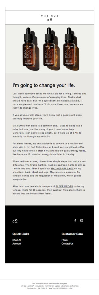
Supplement brand The Nue Company uses a bold statement to open their welcome emails with a splash. (Pun intended.)
The email below, which users receive after signup, keeps things simple above the fold. All you see is one image (repeated three times) and a six-word sentence.
The copy goes on to explain the benefits of the products and the history behind them, but that personalized hook at the top — “I’m going to change your life” — is the hook that keeps you reading.
Lessons For Your Own eCommerce Welcome Emails
- Be Authentic. The bold claim at the top leads to first-person copy that explains the “why” behind it. This builds trust, which is especially important if you’re trying to talk new customers into (literally) consuming your product.
- It’s Okay to Sell. The email tells a story, but it also provides links to products for new subscribers to start ordering. Building the calls to action into the copy makes the next steps obvious without coming off as sales-y.
- Talk About Your Difference-Makers. The Nue Company’s story provides value by explaining the importance of a sleep routine and good “sleep hygiene” in addition to using their products. Again, explaining the “why” hooks the reader and piques interest in the products.
Blue Apron Tells You What it’s All About
Blue Apron provides pre-packaged ingredients and recipes so that you can make tasty and nutritious meals at home. This particular email educates users and builds on the information you’d find in their marketing content and on their website.
The email answers five common questions and has calls to action buttons at the top and bottom.
This email also succeeds by providing striking product and lifestyle imagery throughout. Every image shows a different aspect of the Blue Apron “lifestyle” to draw in potential subscribers.
It’s not a short email, but it reduces potential customer objections and leverages difference-makers in every section.
Lessons For Your Own Welcome Emails
- Answer Common Questions in a Welcome Email. As markets and industries become more competitive, educating subscribers and answering questions they’re likely to ask is a great way to eliminate common doubts or resistance that keeps people from purchasing. By reducing friction and incentivizing action with a discount, Blue Apron increases its chance for a sale.
- Provide Educational Value. Again, every row of Blue Apron’s email is designed to educate subscribers. Other ways to do this for your brand include videos or instructions with graphics. Look at your products and marketing collateral to see where you can provide additional value through education.
- Draw Attention to Important Things with Color and Design. Blue Apron uses negative space and high-quality imagery to guide you through each section. You can use contrasting colors and other design elements, but don’t get carried away — stay focused on your users’ experience.
Huckberry Recommends… Well, Everything
This very, very long welcome email from Huckberry hammers home an important lesson — recommend products to your subscribers.
Shoppers often don’t know what they want until they see it, and if you sell a lot of different products, giving customers a visual smorgasbord to choose from might be the best option.
Another element that makes this email work is the thoughtful design. Each section is laid out differently. Some use product descriptions, some use testimonials (including Jay-Z!), and others use discounts as an incentive.
At the very least, you’ll probably show a new subscriber at least one thing that’s going to catch their eye. And this email shows that they’re trying to be helpful, which goes a long way in building trust and converting subscribers into buyers.
Lessons For Your Own eCommerce Welcome Emails
- Recommending Products is a Win. Your email marketing tool should make it easy to build dynamic messages that recommend products to specific customers and list segments. (And if it doesn’t, you might want to find a new one.)
- Professional Images Can Help You Sell. All of the emails in this post, including Huckberry, use clear, high-quality photos. Images are an important part of eCommerce emails, and yours should look great on all devices and load for all carriers.
- Not Just Mobile-Friendly — Mobile-First. Mobile-friendly email design is essential, as most emails today will be viewed on a mobile device. If your email isn’t scroll-friendly, your subscribers won’t be happy. Most email marketing tools can optimize emails for mobile, but if you’re using many images and design elements, make sure everything flows visually.
- Test. Test your emails before you send them out. Test across as many email clients and mobile devices as possible before adding a new email to your flow.
Sending Your eCommerce Welcome Emails is Just the Beginning
These eCommerce welcome emails have a lot of good elements that, hopefully, inspired a few ideas for your own brand.
But before we go, remember that if you aren’t sending welcome emails yet, start sooner rather than later.
It can be easy to wait until you think they’re perfect, but it’s better to get your welcome emails out into the world to boost your sender score and deliverability rates. And the tracking data you get can help you make effective changes later.
In other words, something is better than nothing. And if you don’t know where to start for your eCommerce store, sign up for a free trial of Sendlane!
