5 Rapidfire Factors to Makeover Your 2020 eCommerce Marketing Email Design and Content


Do email design and content really contribute to the effectiveness of your emails? Now, we all know the saying “Don’t judge a book by its cover.” This is indeed a great saying, but when it comes to marketing—the cover speaks volumes. And this point cannot be emphasized more when it comes to email marketing.
It isn’t just about how good of a product or service you’re selling. If your eCommerce marketing emails aren’t dressed for the occasion, then none of your prospects will entertain them.
So what does it mean to have marketing emails that are dressed for the occasion?
That means your marketing emails need to be two things—good-looking AND interesting. And this brings us to email design and content.
Because while focusing on and making sales are important, it’s just as important to optimize your marketing emails to maximize the sales potential of your marketing emails.
How important is it?
Well, here’s a rundown on some of the benefits you can expect from a well-designed and well-written eCommerce marketing email:
You can evoke emotion from your customers
Put yourself in the shoes of a consumer, have you ever just felt like the need for an unprecedented online shopping spree? Nevermind the day of the week nor the time—people feel the urge to treat themselves.
As eCommerce owners and marketers alike, it’s our job to either steer their emotions or catch them at the right time with the right products and services by showing them exactly what they would want. That’s the power positive emotions have over your behavior as a customer.
Jonah Berger—author of Contagious—described in his book how emotions can affect customer buying behavior. He described how marketers shouldn’t just focus on talking about the features of their products.
Jonah suggests focusing on relating your products and services to your customers’ emotions. And with the power of design and content, you can encourage the right emotions in your potential customers, thus making them more receptive to offers or more likely to take action.
In your case, customers would sign up or just straight up make a purchase.
An example for accomplishing this would be making use of colors like red, orange, and yellow in your emails. Psychologically, those colors evoke energy, positivity, and fun.
Move desires with videos to highlight your services and products
Your marketing emails can help your potential customer experience a piece of what your products are all about. The keyword here is experience.
This is where engaging your customers with content becomes important. Good content is relatable, but great content is immersive. And what better way to engage your customers than using videos in your emails?
Videos help a lot in conveying your brand’s message. Plus, they can save your customers the reading time. They can just sit back and let the information flow into their heads.
Here’s a sample:
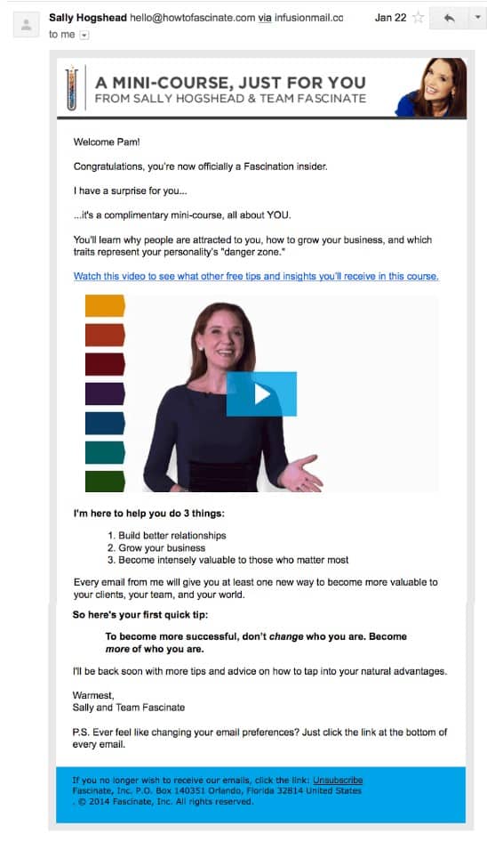
Image source: Pinpointe
You can nurture your customers to their next purchase
Show not tell. With a smart design, you can show more while saying less. We’ll have to admit, as engaging your content may be, not everyone’s going to read everything that’s on your marketing email.
So one of the best things you can do is use subtle visual cues to direct your customers to the next course of action that you want them to take.
Give your “Sign Up” button an eye-catching color or compose your graphics and visuals to lead your readers’ eyes to a link to your website.
This way, your emails will feel less intrusive and your potential customers will feel more like they are in control of what they choose to do next.
When in reality, you simply subtly suggested what they should do.
You can make your Call-To-Action more alluring
One of the main objectives of your marketing emails is to get your potential customers to take the next action.
This is where call-to-actions (CTAs) come into play, but how can you get your potential customers to respond accordingly? With the right design, you can get your customers to convince themselves to click on your CTA button.
Use contrasting colors for your CTAs and use white space to your advantage to make them stand out from the rest of the email.
Here’s a great example of this. Even though the color used for the CTA is a rather soft blue, it still stands out from the plain white background:
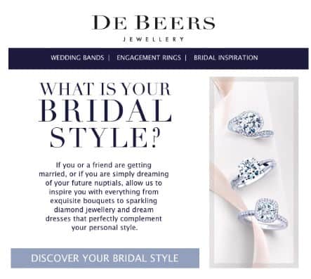
Image source: Campaign Monitor
Also, mind the size of your CTA button. Make it big enough to be noticed but not too big that it’s overwhelming.
Finally, use action words to drive your customers to action. Below, the words “Register Now” were used rather than generic words like “Click Here.” Why is the former more effective than the latter? Because with action words, customers will already know what they’ll be getting from clicking on your CTAs.

Image source: Campaign Monitor
You can increase your conversion rate
Human beings are creatures of emotions. They are prone to attaching meanings behind almost anything — actions, words, events, etc.
So engaging your potential customers using your emails can convince them to take action. Doing this consistently will eventually increase your conversion rate.
For design, color once again proves to be the primary reason for consumers when deciding to buy a product. And that’s according to 85% of consumers.
For content, it all boils down to your ability to tell an engaging story. You can make your potential customers feel the shoes your online store sells are more than just simple footwear. With enough creativity, you can convince your potential customers those shoes can change their lives.
Maybe craft a story that can best describe how your store’s shoes would feel.
Feel your shoes embracing the form of your feet for maximum comfort while still giving you enough room for your day-to-day adventures.
Suddenly those shoes would make you feel like you can accomplish anything, right? Give your customers something to dream about when looking at your products.
We mustn't forget the aesthetic value of emails
Marketing emails should be designed beyond their main function, rather than settling with the bare minimum. Today, customers are oversaturated with ads, promos, commercials, and the like. So the best eCommerce marketers can do is at least make viewing of their marketing emails fun, engaging, and exciting for their customers.
Are your marketing emails still not getting any bites? Or do your email marketing strategies need some much-needed tweaks or overhauls? Schedule a free 30-minute strategy meeting with us so you can get the email marketing help you need and deserve! Plus, as an AdLeaks member, you get $200 off every single month! Hit us up—we’re excited to power your emails for maximum results!
