
Best Practice: Facebook Cover Photos
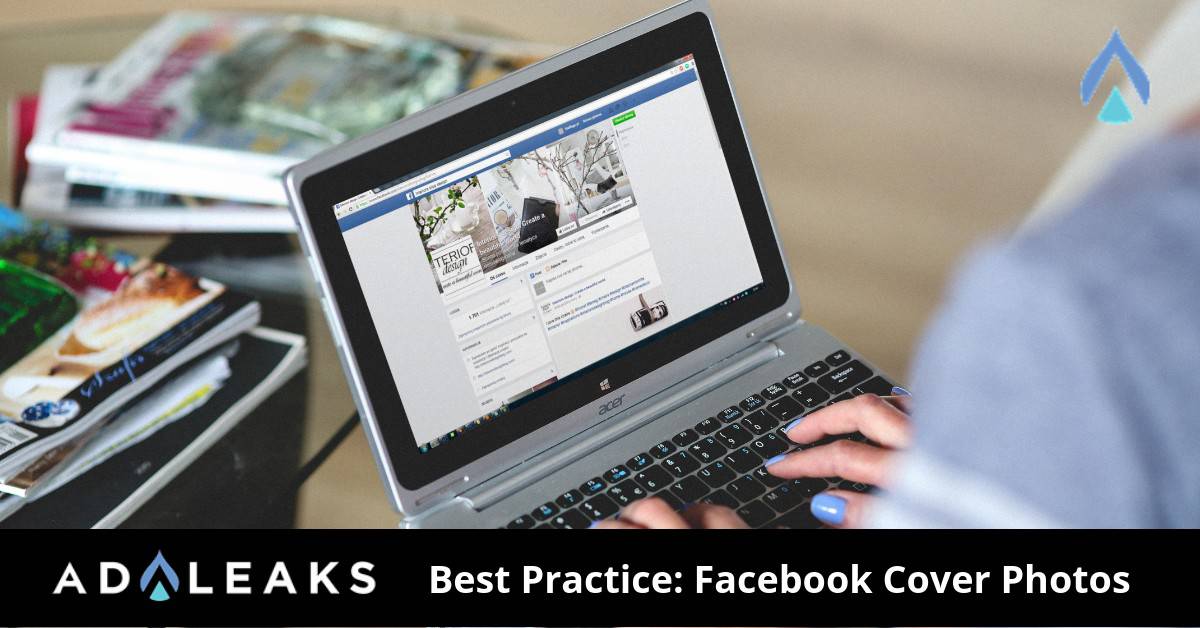

When people visit your Facebook page, the first two things they see are your profile picture and your cover photo. That being said, you need to make sure both look clear, captivating and creative.
On most browsers, your cover photo takes up about a quarter of the entire screen. That is a lot! You need to make sure your Facebook cover photos draw in your visitor's attention and keep it.
Size Matters

Optimize your cover photo for the right dimensions. That is 851 pixels wide and 315 pixels tall for desktop and 640 pixels wide and 350 pixels tall for mobile. Facebook will stretch your image to fit if an incorrect size, making your photo blurry. For maximum quality, stick to the provided dimensions above.
Follow The Rules
Abide by Facebook's cover photo guidelines. Key takeaways from the guidelines:
- Your photo cannot be deceptive or infringe another's copyright.
- The photo is public.
- You may not encourage other users to upload your cover photo on their own pages.
Facebook could take action against your page for violating the terms above, so be sure to comply with their guidelines.
Limit Text
Facebook previously included a rule in their guidelines restricting text to 20% of your cover photo. All reference to this guideline was removed back in 2013 but we recommend still loosely following. While 20% may be a little restricting, don't include too much text on your Facebook cover photos. Having a wordy cover photo can lose the attention of your visitors.
Keep It Cohesive
Give your cover photo a focal point and stick with colors that match your brand and logo. Some of the most captivating cover photos include a focal point to grab attention and a color scheme that is cohesive with their brand. Remember that your Facebook Page is a direct representation of your company and the visitors should feel that way when on your Page.
You can also utilize white or empty space to include copy, which will stand out even more against the plain background. In addition, don't try to blend in your profile picture with your cover photo. It can be confusing to users and doesn't allow you a second opportunity to have a profile picture that is equally as captivating as your cover.
Accentuate CTA Buttons
Your ultimate goal is to get Page visitors to your website. Depending on your business, you will be able to add call-to-action buttons in the bottom right corner of your cover photo. Keep this in mind while designing your cover photo. Keep the bottom right corner less busy so the CTA buttons stand out and get people over to your website. Some examples of CTA buttons here could be "Sign Up", "Shop Now" or "Use App".
Pin A Post On Your Timeline
Pinning a post on your timeline will keep that specific post at the top of your Page's feed, just below the cover photo. You are giving people a very clear call-to-action at the top of your Page when doing this. Pin a post that has a CTA button, a lot of engagement and a clear description of your business.
Facebook Cover Video
Facebook now supports adding a cover video that is between 20 and 90 seconds long and that is within the dimensions mentioned previously. This could be an excellent way of showing some captivating content depending on your business. If you opt for a video, keep it as clean and clear as a cover photo while still dazzling the visitor.
Be Creative
Have fun designing your cover photo and be creative. Keep in mind that an exceptional cover photo can lure in users and could be the reason they stay on your Page.
Happy Hunting!


