5 More Ways to Improve Form Performance


Are your forms converting customers effectively?
In our high-converting landing page series, we discussed how minimizing on-page distractions can help draw visual attention to your form and generate more conversions.
(That’s still a good idea, by the way.)
But if you want to get the most out of your forms, the work doesn’t end there. Here are five more ways to improve form performance and give one of your most important marketing tools a boost.
1. Multi-Step Forms
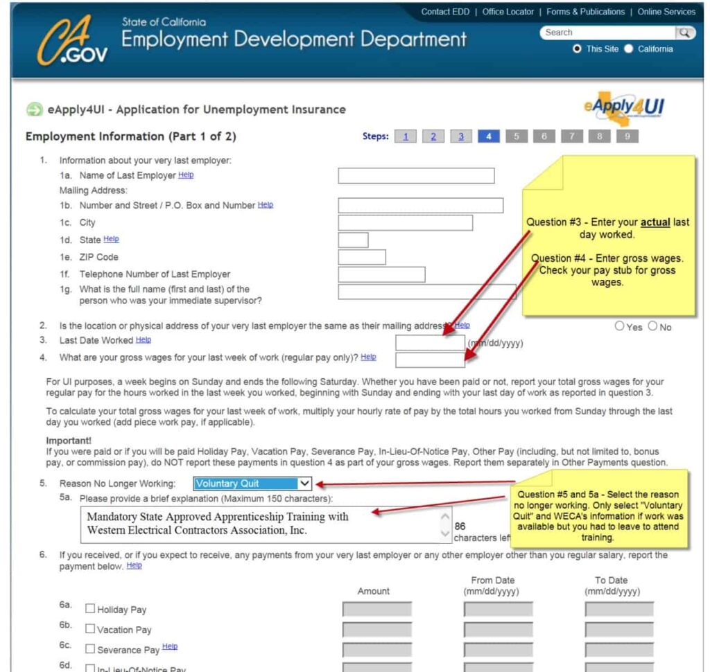
Online marketers know that a long and complex form is usually a no-no. If you have too many boxes to fill out, your users aren’t likely to stay long.

Unless you have a captive audience like the California unemployment board, of course. - image source
To avoid this problem, however, most marketers run too far the other way.
Their forms only ask for a lead’s name, email, and phone number. This can be intimidating too, however, because now you’re asking for precious personal information without so much as a how-do-you-do.
The happy medium? A multi-step form with incremental, escalating questions. Setting up a multi-step form can increase conversions for at least three reasons:
1) They Create a Relationship
Now, we obviously aren’t talking about a “til death do us part” situation here.
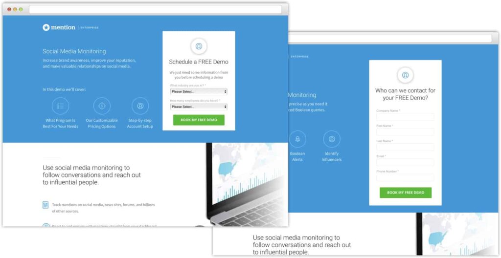
But by spreading your form fields across multiple steps, you’re creating a first “yes” that acts as a motivator to keep saying “yes” as the form proceeds.

The old form on the right requires user input, while the first stage of the new form on the left can be completed with a few clicks. - image source
This tactic isn’t exclusive to forms, of course. it’s a form of compliance psychology, which states that internal pressure to behave consistently leads people to make bigger commitments that match up with their first choice.
2) Protecting User Anonymity
Another benefit of multi-step forms is that you can ask questions that don’t require personal information to get that first “yes.”
Here’s a simple example. Let’s say you offer heating and air conditioning services, and your current form asks for the customer’s name, phone number, email, and a description all at once.
With a multi-step form, you could start with clickable “Heating” and “Air Conditioning” buttons that lead the user to the next stage of the form. This simple addition engages the user, with the additional benefit of…
3) Qualifying Your Leads
Incorporating anonymous or low-stakes questions in the initial stages of your multi-step form isn’t just for show. You can ask questions that will help you learn more about the users’ needs and provide a more personalized response based on the information they provide.
Ask your sales team what questions they ask early in the process, and see if you can add those to your form. Consider using drop-down menus or “Choose an Option” buttons to reduce friction in the early stages as well.
2. Use a Popup
Popup forms can vary in lots of ways, including when and where they appear, their size and shape, and much more. But every popup form needs at least four basic elements to succeed, as defined by Crazy Egg:
- Marketing copy. This is the text that describes your offer, explains the benefits, and leads the user to convert.
- Branding. Including your logo and using the same colors and fonts as your website creates a seamless user experience. It also lets visitors know that their window isn’t being hijacked.
- Imagery. Your form will need visual or non-text elements to reinforce your message and your offer. This could be a product image, a photo of someone using your product, or some other eye-catching incentive.
- Call to Action. The fields your user completes and button your user clicks that completes your form.
Also -- consider this The Fifth Element -- you have to make it worth their time.

The movie "The Fifth Element" is also worth your time, if you’re into goofy ‘90s sci-fi. - image source
No form will convert effectively if the user doesn’t want what you’re offering.
And this goes double for popups. If you stop the user from closing your tab or keep them from scrolling down the page any further with a popup form, the offer you show them had better be compelling.
3. Prefilled Data
You may have noticed that one of the themes running through our tips to improve form performance is making the user do less work. Less typing, less clicking, and, whenever possible, less thinking.
Modern browsers and “smart forms” can help you take this principle further by automatically adding user information to your form with a few keystrokes.
By enabling “prefilled” forms, contacts that have their data synced in their browser can autocomplete standard fields like name, email, phone number, address and more.
This reduces the user’s need to input information, which can improve your conversion rate. You’re also less likely to get mistyped data from prefilled forms, which will improve your overall lead quality.
4. Active Call To Action
We’ve already mentioned that your form needs a call to action. (It wouldn’t be much of a form without one.)
But your CTA isn’t just a button -- it’s your last chance to convince the person on your page to commit. It’s the tipping point that will either convert users or send them elsewhere.
And you know what word isn’t very convincing? “Submit.”
Upgrade your CTA with words that reinforce the benefit of your offer. Phrases like “Start My Free Trial,” “Place Your Order,” or “Get My eBook,” for example, refer back to the value your prospect will receive. They also include action words that are harder for users to ignore.
Also, don’t ignore details like the size, shape, and color of your call to action button -- these simple visual cues can have a major effect on your form’s performance.
5. Chatbots
We’ve covered the usefulness of chat tools for conversion in a previous post, so we won’t repeat ourselves here. But some chat tools can provide specific support for forms that make both perform better than they would have on their own.
For example, pages with lots of detail might benefit from a chatbot, which can provide information or answer questions that aren’t readily apparent. That same page, however, can include an exit-intent popup asking users to join an email newsletter or follow you on social media.
Improve Form Performance to Convert Users Effectively
As we just mentioned, a lot of these recommendations aren’t meant to be used in a vacuum. Chat tools and pop-up forms can live on the same landing page, prefilled forms can have active calls to action, and so on.
The only way to really know what will engage your audience is to test these tactics and see what works. But if you start making changes using the list above, improvements should only be a matter of time.
What tricks are you using to improve form performance? Join AdLeaks today to share your ideas and get more exclusive digital marketing tips and strategies.


